TL;DR:
- Effective period home palettes combine warm neutrals with jewel tones for architectural details, respecting original materials. Consistent undertone matching and appropriate finishes are essential to achieve authentic depth and harmony. Selecting colors that reflect the material environment and layering with textiles enhances the period aesthetic.
Warm neutrals paired with carefully chosen jewel tones form the most effective palette foundation for period homes, preserving architectural authenticity while creating spaces that feel genuinely alive. The right paint colour ideas for period homes go well beyond picking a shade you like. They require understanding how undertone temperature interacts with original timber, stone, and plasterwork. Brands like Farrow & Ball, Dulux Heritage, and traditional distemper suppliers have spent decades refining palettes that honour this relationship. This guide covers the full picture, from classic colour families and finish choices to specific 2026 designer recommendations and exterior application strategies.
1. Classic paint colour families for Georgian, Victorian, and Colonial homes
The traditional palette base across all major period styles draws from warm creams, ochres, tawny beiges, and muted earth tones. These are not accidental choices. They were dictated by available pigments and the way candlelight and early gas lighting rendered colour on plaster walls. Understanding this history makes colour selection far more intuitive.
Georgian and Colonial homes relied heavily on what 18th-century painters called lead whites, creams, drab, and straw yellow as their neutral foundations. Fawn and warm stone tones completed the palette, with muted sage greens and dusty blues appearing in more formal reception rooms. These were never bright or saturated. The pigment technology of the era simply did not produce the vivid tones we associate with modern paint.
Victorian homes operated on a different logic. Multi-colour schemes were standard, often using three or more colours on a single facade or interior scheme. The critical discipline was tonal harmony. Colours were selected from within one family or spectrum, with darker tones reserved for architectural details like window sashes, cornices, and door surrounds. This approach created visual richness without chaos.
Key colour families by period style:
- Georgian and Colonial: Warm off-whites, straw yellows, fawn, drab grey-greens, dusty sage, and muted cobalt blue for feature rooms
- Victorian interior: Deep burgundy, forest green, rich teal, and warm terracotta for reception rooms; lighter ochres and creams for upper floors
- Victorian exterior: Three-tone schemes using a mid-tone body colour, a darker trim, and a lighter highlight on ornamental details
- Edwardian: Softer, lighter versions of Victorian palettes; pale greens, warm whites, and muted rose tones reflecting the era’s shift toward lighter interiors
- Federation (Australian): Rich ochres, deep reds, and warm khakis on exteriors; creamy whites and warm greens inside
2. How to apply paint finishes and textures authentically
Finish and sheen are as important as colour in period homes. A flat modern acrylic on a Victorian plaster wall will never look quite right, regardless of how accurate the colour is. The pairing of matte walls with glossy woodwork is one of the most impactful techniques in heritage painting, and it is grounded in centuries of practice.
Distemper paints, made from chalk, pigment, and a binder such as animal glue or casein, produce the soft, powdery matte finish seen in Georgian and early Victorian interiors. This finish absorbs light rather than reflecting it, giving walls a depth that flat modern paints rarely achieve. Traditional distemper is breathable, which matters enormously in older homes where moisture movement through walls is part of the building’s natural behaviour.
Oil-based paints were historically reserved for woodwork, doors, and window joinery. Their higher sheen created a deliberate visual contrast with matte walls, drawing the eye to architectural details and adding a sense of refinement. Modern equivalents include water-based eggshell and semi-gloss finishes, which can replicate this effect while meeting contemporary durability requirements.
Pro Tip: Test your chosen finish on a 30cm square patch and observe it across morning, midday, and evening light before committing. Matte finishes can appear chalky in bright daylight but beautifully warm under artificial light, which is often the dominant light source in period rooms.
Recommended finish combinations for period homes:
- Walls: Distemper, flat acrylic, or low-sheen acrylic for a period-appropriate matte quality
- Cornices and ceiling roses: Flat or low-sheen white to preserve detail without glare
- Skirting boards and architraves: Water-based semi-gloss or oil-based enamel for durability and contrast
- Doors and window joinery: Full gloss or semi-gloss oil-based enamel to replicate historic woodwork finishes
- Exterior weatherboards: Satin or low-sheen exterior acrylic for weather resistance without a modern plastic appearance
For more detail on matching sheen levels to specific heritage surfaces, the guide to heritage paint finishes covers commercial options that perform well in Melbourne’s climate.
3. Modern paint colours that are period-appropriate in 2026
Period-appropriate paint colours are not all subtle neutrals. Expert designers recommend muted greens, warm greys, and dusty terracottas to enrich older home interiors without introducing a modern sensibility. The key distinction is saturation. Period colours are never vivid or clean. They carry grey, brown, or yellow undertones that anchor them to natural materials.
Farrow & Ball’s Skimming Stone is a warm grey with strong yellow and pink undertones that reads as a sophisticated neutral in period interiors. Dead Salmon, despite its unappealing name, is one of the most requested heritage colours in Melbourne’s inner east. It is a pinky beige with enough grey to avoid looking sweet, and it works particularly well in Edwardian hallways and reception rooms. Red Earth is a dusty terracotta that functions as a statement accent colour in Victorian dining rooms and studies.
Sherwin-Williams’ Rookwood Sash Green and Oak Moss translate well to Australian Victorian and Federation homes, particularly for exterior trim and verandah joinery. Dulux Heritage’s range includes several Australian-specific tones developed with local light conditions in mind, which is a genuine advantage given that Melbourne’s light reads cooler and more blue-grey than northern hemisphere conditions.
Practical guidance for colour selection:
- Avoid stark whites and cool greys. They create visual tension against warm timber floors, red brick, and original plasterwork
- Test swatches in the actual room under both natural and artificial light before purchasing full quantities
- Select colours from within the same undertone family for walls and trim to maintain period-authentic harmony
- Use richer, more saturated tones in intimate rooms like studies and bedrooms, where lower light levels make depth appropriate
- Reserve lighter, airier tones for public areas and rooms with strong natural light
For a deeper look at Victorian and Edwardian palettes, Sol Shine’s resource covers historically grounded colour combinations specific to Melbourne’s most common period home styles.
4. Exterior paint colours: orientation, light, and period style
Facade orientation directly determines which undertone family works best on a period home exterior. South-facing facades can carry more saturated tones because they receive consistent, indirect light throughout the day. North-facing facades need warmer undertones to counteract the cooler, shadowed appearance that direct morning and afternoon light can create.
Warm off-whites outperform pure cool whites on almost every period facade in Melbourne. Cool whites read as stark and clinical against red brick, sandstone, and heritage render. Dulux Lexicon Quarter, a warm off-white with subtle grey and yellow undertones, is one of the most widely used exterior colours on Melbourne’s Victorian and Edwardian homes for exactly this reason.
Victorian multi-colour exterior schemes require discipline to execute well. Selecting colours from a single spectrum family and restricting the darkest tones to trim, brackets, and ornamental details preserves the period character without producing a result that looks busy or confused. A typical three-colour Victorian scheme might use a warm stone body colour, a deep forest green or burgundy for window sashes and fascias, and a cream or warm white for ornamental highlights.
| Facade orientation | Recommended undertone | Example colours |
|---|---|---|
| North-facing | Warm (yellow, red, brown) | Dulux Lexicon Quarter, Farrow & Ball String |
| South-facing | Warm to neutral | Farrow & Ball Skimming Stone, Dulux Antique White USA |
| East-facing | Warm neutral | Dulux Natural White, Farrow & Ball Elephant’s Breath |
| West-facing | Warm (avoid cool greys) | Dulux Hog Bristle, Farrow & Ball Hardwick White |
For specific exterior colour recommendations suited to Melbourne’s heritage suburbs, Sol Shine’s exterior colour guide covers orientation, material compatibility, and period-accurate schemes in detail.
5. Undertone consistency: the rule that holds every scheme together
Undertone consistency is the single most important principle in period home colour selection, and it is the one most commonly overlooked. Anchoring all painted surfaces in a consistent undertone temperature prevents the visual clashes that make renovated period homes feel unsettled. Warm timber floors and original Baltic pine joinery demand warm-undertoned paints on walls and ceilings.
A practical technique is to select one warm-white family for both walls and trim, then allow the moulding profiles themselves to create contrast through shadow rather than colour difference. This is how Georgian interiors achieved their refined, layered appearance without using multiple distinct colours. The depth comes from light falling across plasterwork, not from contrasting paint tones.
Mixing warm and cool undertones in the same room is the most common costly painting mistake in period home renovations. A cool grey wall paired with warm cream trim will always look slightly wrong, even if neither colour is objectionable on its own. The solution is to test undertones against your fixed elements, specifically your floor, timber, and any original tiles or brickwork, before selecting any paint.
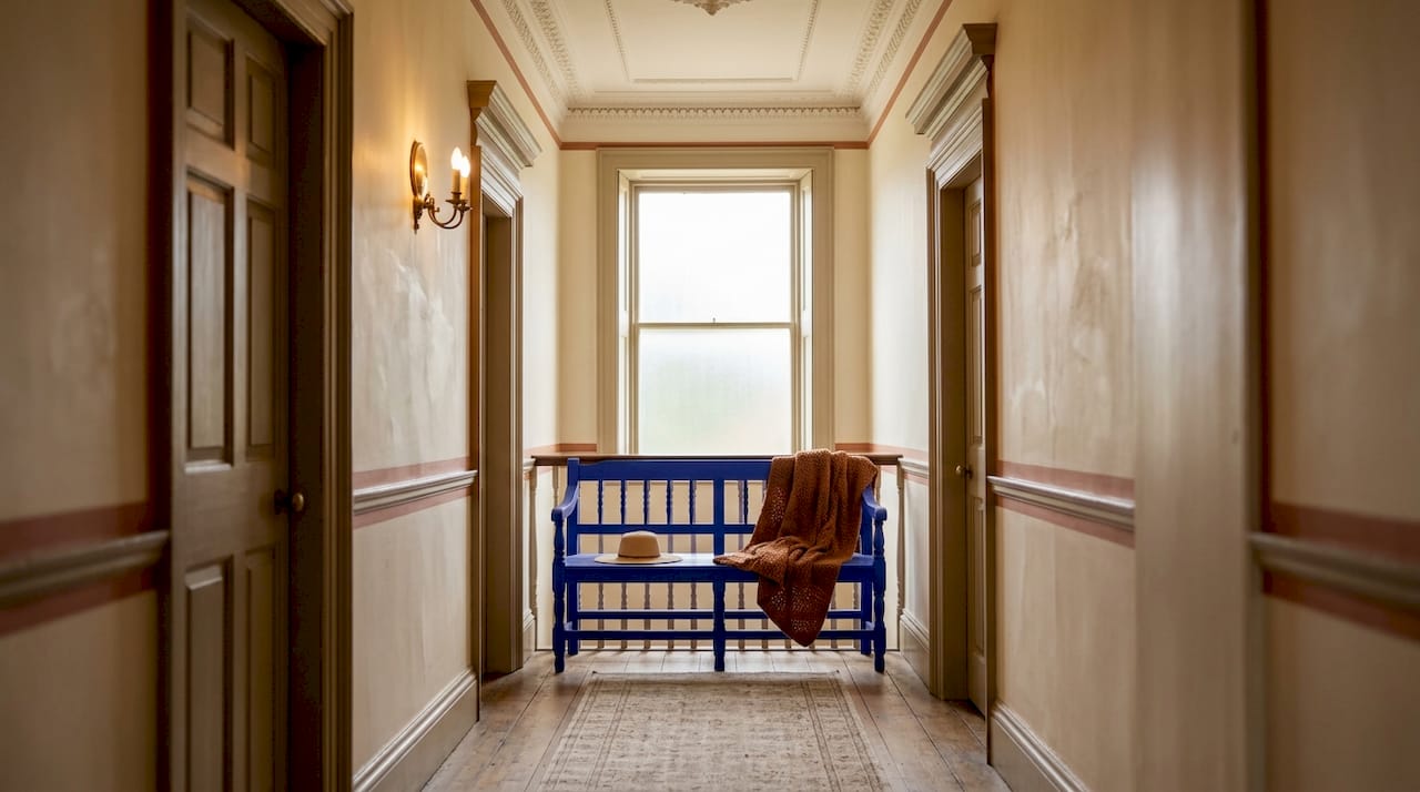
6. Layering colour with textiles and furnishings for period depth
Paint colour alone does not create the richness associated with well-executed period interiors. The distribution of colour across architectural trim is only one layer. Textiles, rugs, and furnishings complete the palette and allow you to introduce tones that would be too intense on walls.
A Victorian drawing room painted in Farrow & Ball Mole’s Breath, a warm grey-brown, becomes far more interesting when anchored by a Persian rug with burgundy and gold tones, and dressed with curtains in a deep teal or forest green. The paint provides the neutral foundation. The furnishings carry the jewel tones that the period palette demands. This layered approach also gives you flexibility. You can shift the character of a room by changing textiles without repainting.
Period homes with partner resources on traditional colour often highlight how joinery and cabinetry colour choices extend the paint palette into three dimensions. Wardrobe doors, kitchen cabinetry, and built-in shelving painted in complementary heritage tones create continuity that reinforces the period character throughout.
Key takeaways
The most effective paint colour ideas for period homes combine warm-undertoned neutrals as a base with controlled jewel tones on architectural details, all unified by consistent finish choices that respect the building’s original materials.
| Point | Details |
|---|---|
| Undertone consistency is non-negotiable | Match wall and trim undertones to your timber floors and original joinery to avoid visual clashes. |
| Finish matters as much as colour | Pair matte walls with semi-gloss or gloss woodwork to recreate authentic period depth. |
| Restrict saturation to trim and details | Apply darker, richer tones to sashes, cornices, and architraves rather than walls for period accuracy. |
| Orientation guides exterior colour choice | South-facing facades suit more saturated tones; north-facing facades need warmer undertones. |
| Test extensively before committing | Observe swatches across morning, midday, and evening light in the actual room or on the actual facade. |
Why undertone is the conversation most homeowners skip
I have walked through hundreds of period homes in Melbourne’s inner east and bayside suburbs, and the pattern is consistent. Homeowners spend weeks choosing between Farrow & Ball colours, agonise over whether to use Dead Salmon or Elephant’s Breath, and then apply both over a cool-toned primer that undermines everything. The colour on the wall looks nothing like the swatch, and no one can explain why.
The answer is almost always undertone. Warm period colours need warm preparation surfaces and warm adjacent materials to read correctly. When you place a warm pinky beige next to cool grey render or a cool white ceiling, the warm tone looks muddy and confused. The same colour on a properly prepared warm-toned surface looks refined and intentional.
My honest advice is to spend less time comparing individual colours and more time understanding the undertone temperature of your fixed elements. Your Baltic pine floors, your red brick, your original render. Once you know whether your home reads warm or cool at its core, the paint selection becomes far more straightforward. You are not choosing a colour in isolation. You are choosing a colour that belongs to a specific material environment.
The other thing I would stress is that period authenticity does not require period discomfort. A Victorian study painted in a deep, saturated green with high-gloss joinery is not a museum recreation. It is a room that functions beautifully for modern living while honouring the craftsmanship of the original builders. That balance is entirely achievable with the right colour and finish strategy.
— Jarrad
Bring your period home’s colour to life with Sol Shine

Choosing the right paint colours for a period home is one thing. Applying them with the precision and care that heritage properties deserve is another. Sol Shine specialises in interior painting for period homes across Melbourne’s inner east and bayside suburbs, including Kew, Hawthorn, Camberwell, Brighton, and Malvern. The team understands the specific demands of Victorian and Edwardian homes, from surface preparation on original plasterwork to finish selection for ornate timber joinery. For exterior projects, Sol Shine’s heritage painting services cover everything from facade colour consultation to weatherboard replacement and render repair. If you are planning a significant painting or restoration project, contact Sol Shine for a personalised consultation.
FAQ
What are the best base colours for period home interiors?
Warm creams, ochres, tawny beiges, and muted earth tones form the most widely used traditional palette base across Georgian, Victorian, and Edwardian homes. These tones harmonise with original timber and plasterwork better than cool or stark modern neutrals.
Should I use the same colour on walls and trim in a period home?
Selecting one warm-white family for both walls and trim and allowing moulding profiles to create contrast through shadow is a period-authentic technique. Contrasting warm walls with cool trim, or vice versa, creates visual tension that undermines the scheme.
What paint finish is most appropriate for period home walls?
Matte or low-sheen finishes on walls, paired with semi-gloss or full-gloss on woodwork, replicate the historic finish contrast that defines authentic period interiors. Distemper is the most historically accurate option for interior walls in pre-Federation homes.
How do I choose exterior colours for a Victorian home?
Select colours from within one tonal family and reserve the darkest tones for trim, sashes, and ornamental details. Multi-colour Victorian schemes work best when saturation is controlled and the body colour remains a mid-tone rather than a deep or vivid shade.
Are Farrow & Ball colours suitable for Australian period homes?
Farrow & Ball colours like Skimming Stone, Dead Salmon, and Red Earth translate well to Australian Victorian and Edwardian homes, particularly in Melbourne’s inner suburbs. Dulux Heritage offers Australian-specific tones developed for local light conditions, which can be a practical alternative for exterior applications.


