
TL;DR:
- Breathable, lime-based paints are essential for Victorian and Edwardian homes to prevent moisture damage and preserve original materials. Testing physical samples in the home’s specific light conditions ensures accurate colour choices that enhance architectural details and historical character. Using appropriate finishes and historical palettes maintains the structural integrity and aesthetic authenticity of period interiors and exteriors.
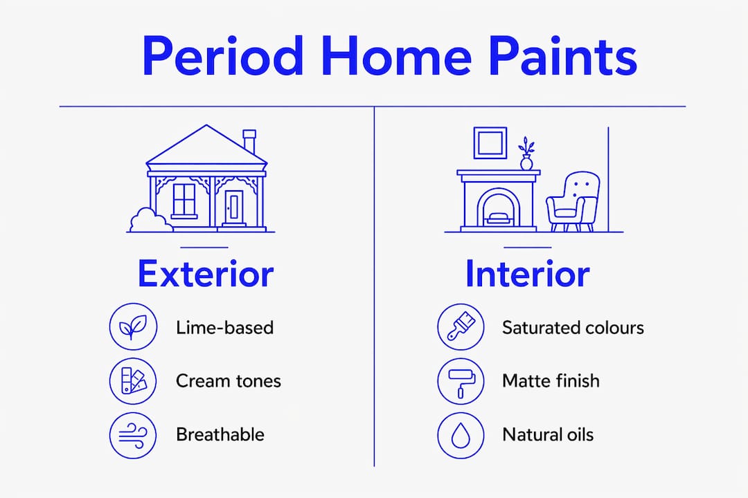
Period home paint options are defined by one non-negotiable quality: breathability. For Melbourne’s Victorian and Edwardian homes, selecting paints made from natural ingredients such as lime, chalk, clay, and plant oils is not a stylistic preference. It is a structural necessity. Modern plastic-based acrylics trap moisture within traditional masonry and timber, causing damage that compounds over years. Brands like Edward Bulmer Natural Paint and Little Greene have built their reputations on historically accurate, microporous formulations that protect original building fabric while delivering the rich, saturated colour palettes these homes deserve.
Why breathable paint is essential for period homes
Breathability is the single most important technical criterion when choosing paint for a Victorian or Edwardian home. Traditional building materials, including lime mortar, handmade brick, sandstone, and old-growth timber, are designed to absorb and release moisture as conditions change. Sealing them with an impermeable coating disrupts this natural cycle entirely.
Impermeable plastic-based paints cause moisture trapping that leads to peeling, blistering, and damp within two to five years in period homes. That timeline matters because the damage is often invisible until it becomes expensive. By the time you see paint lifting off a rendered façade or damp patches appearing on an internal wall, the moisture has already been working against the substrate for months.
Natural and lime-based paints form microporous coatings that protect period exteriors while allowing moisture to escape, increasing longevity and reducing maintenance. This approach works in harmony with traditional masonry and lime mortar rather than against it. The result is a finish that lasts longer, requires less remedial work, and preserves the structural integrity of the original building fabric.
The most suitable breathable options for Melbourne period homes include:
- Limewash for rendered and masonry exteriors, providing a soft, chalky finish with natural antibacterial properties
- Mineral silicate paints for brick and stone, which bond chemically with the substrate rather than sitting on top of it
- Natural oil-based paints for timber joinery, sashes, and weatherboards, offering deep penetration and flexible protection
- Distemper for interior plaster walls, delivering a flat, chalky finish that is entirely vapour-permeable
Pro Tip: Before applying any paint to original lime-rendered walls, test a small area with a breathability indicator or consult a heritage specialist. Applying a modern acrylic sealer as a primer beneath a breathable topcoat defeats the purpose entirely.
What are the best historical colour palettes for period homes?
Historic colours were engineered to accentuate architectural details, serving both aesthetic and conservation goals simultaneously. This is why the colour palettes associated with Victorian and Edwardian homes feel so cohesive. They were not chosen arbitrarily. They were developed to work with the proportions, materials, and natural light conditions of the era.
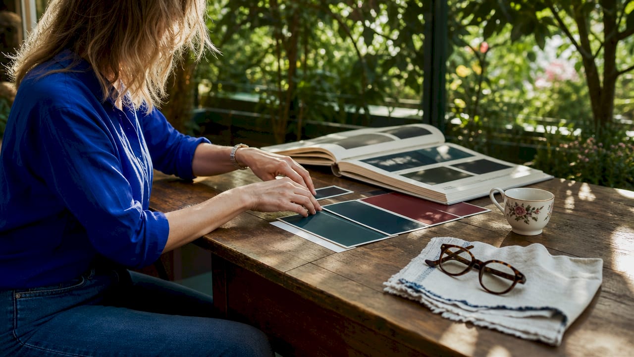
Period interiors benefit from saturated historical colours like deep teals, burgundies, bottle greens, and warm umbers, particularly in smaller rooms or spaces with limited natural light. High ceilings and ornate cornicing in Victorian homes actually call for bolder colour choices. A neutral palette in a room with elaborate plasterwork reads as timid and can make the space feel flat rather than refined.
For Melbourne homeowners working through a period home accent colour selection guide, the following palette framework is a reliable starting point:
| Location | Recommended colours | Finish |
|---|---|---|
| Exterior façade | Cream, warm stone, soft ochre | Limewash or mineral paint |
| Exterior trim and joinery | Bottle green, deep burgundy, charcoal | Natural oil gloss |
| Main living areas | Warm umber, sage green, dusty rose | Flat or matte distemper |
| Hallways and alcoves | Deep teal, forest green, rich burgundy | Flat or eggshell |
| Ceilings | Slightly deeper shade than walls | Flat or matte |
Heritage colour schemes for period home exteriors typically include dark greens, burgundies, cream, and earthy neutrals for a moody, heritage look. These palettes align well with traditional sash windows, brickwork, and roofing materials common across Melbourne’s inner east and bayside suburbs. A Hawthorn or Camberwell terrace with deep green joinery against a warm cream render is not a trend. It is a historically grounded choice that will remain appropriate for decades.
Natural pigments also behave differently from synthetic ones under light. They shift subtly across the day, picking up warmth in the morning and deepening in the afternoon. This quality gives period rooms their characteristic sense of depth and atmosphere, something a flat synthetic colour simply cannot replicate.
Exterior vs interior paint: which types suit period surfaces?
Choosing the right paint type for each surface is as important as choosing the right colour. The wrong product on the wrong substrate will underperform regardless of how carefully the colour was selected.
Traditional finishes for historic plaster walls are flat or matte to highlight texture, while oil gloss is reserved for woodwork to create contrast. This pairing is not purely aesthetic. Flat finishes on plaster walls allow the surface to breathe and show the natural variation of hand-applied plaster, which is part of the character of a period interior. Gloss on timber joinery provides a durable, cleanable surface that also reflects light in a way that frames doorways and windows beautifully.
| Surface | Recommended paint type | Finish | Avoid |
|---|---|---|---|
| Lime-rendered exterior walls | Limewash, mineral silicate | Flat, chalky | Acrylic masonry paint |
| Brick exterior | Mineral silicate or breathable masonry | Flat | Any film-forming paint |
| Timber weatherboards | Natural oil-based paint | Satin or low sheen | Thick acrylic coatings |
| Interior plaster walls | Distemper, chalk paint | Flat or matte | Vinyl silk, high sheen |
| Timber skirting and joinery | Oil-based or alkyd paint | Gloss or semi-gloss | Water-based acrylic gloss |
| Kitchens and bathrooms | Breathable eggshell | Eggshell | High-gloss modern finishes |
Eggshell is the appropriate compromise for moisture-prone areas like kitchens and bathrooms in period homes. It offers slightly more durability and wipe-ability than flat distemper while still maintaining a low sheen that suits the period aesthetic. Avoid high-gloss modern finishes on walls in these rooms. They clash with the texture of original plaster and look conspicuously out of place against period detailing.
Pro Tip: For timber sashes and window frames, an oil-based paint with a slow drying time penetrates deeper into the grain and provides better long-term protection than fast-drying water-based alternatives. This is particularly relevant for Melbourne’s variable climate, where timber expands and contracts significantly across seasons.
How to choose and test period home paint colours
Selecting the right colour from a paint card or digital swatch is unreliable. Physical sample testing is the only method that accounts for the specific light conditions, surface texture, and surrounding materials in your home. This is not a minor consideration. It is the difference between a colour that transforms a room and one that looks nothing like you expected once it dries.
Follow these steps to test and select period home paint colours with confidence:
-
Order physical samples from your chosen heritage paint brand, whether that is Edward Bulmer, Little Greene, or Farrow and Ball. Apply them to a large piece of card or directly to the wall in an area at least 30 centimetres square.
-
Observe at multiple times of day. Testing paint colours with physical samples is critical because varying light conditions, especially in north-facing rooms, require warm earth tones to avoid flatness. Check your sample in morning light, midday, and evening under artificial light.
-
Consider the room’s orientation. South-facing rooms in Melbourne receive strong, direct light that can wash out warm tones. North-facing rooms receive cooler, more diffuse light that can make cool colours feel cold and uninviting. Adjust your palette accordingly.
-
Select trim colours last. Stark white trim paint flattens architectural details. Better choices are antique white, warm ivory, or tonal relatives of the wall colour. These soften contrast and harmonise with period detailing rather than competing with it.
-
Address the ceiling deliberately. Painting the ceiling a slightly deeper shade than the walls adds depth and creates a cosy atmosphere in period rooms with high ceilings. This treatment, known as the fifth wall, is historically grounded and visually enriching, particularly in rooms with decorative cornicing.
Bold colours in period homes, when placed thoughtfully, brighten interiors and prevent them from feeling flat or cave-like. Hallways are an ideal location to introduce a deeper, more saturated tone. They are transitional spaces where you spend less time, which makes them perfect for a bolder statement that sets the tone for the rest of the home. For coordinating your cabinet and joinery colours with your chosen wall palette, it helps to work from a consistent heritage colour family rather than mixing across different brand ranges.
Pro Tip: When layering finishes across a period interior, use a consistent undertone across all colours in the space. If your wall colour has a warm yellow undertone, select a trim colour with the same undertone. Mixing warm and cool undertones in the same room creates visual tension that is difficult to identify but immediately felt.
Key takeaways
Selecting breathable, historically accurate paints is the foundation of any successful period home restoration, protecting both the building fabric and the aesthetic integrity of the architecture.
| Point | Details |
|---|---|
| Breathability is non-negotiable | Use lime-based or natural oil paints to prevent moisture damage in Victorian and Edwardian homes. |
| Match paint type to surface | Distemper suits interior plaster; oil gloss suits timber joinery; limewash suits rendered exteriors. |
| Saturated colours suit period rooms | Deep teals, burgundies, and bottle greens complement high ceilings and ornate plasterwork. |
| Test samples in real conditions | Observe physical samples at multiple times of day before committing to any colour. |
| Avoid stark white trim | Warm ivory or tonal wall relatives harmonise with period detailing far more effectively. |
My honest view on heritage paint and period homes
I have worked on Victorian and Edwardian homes across Melbourne’s inner suburbs for many years, and the most common mistake I see is homeowners choosing paint based on what looks good in a showroom or on a screen. Period homes have their own logic. The materials, proportions, and light conditions are specific to the era, and the paint choices need to respond to that context rather than override it.
The second most common mistake is playing it too safe with colour. There is a tendency to default to off-white walls and white trim in period homes because it feels neutral and inoffensive. In practice, it strips the character out of a room that was designed to carry strong, saturated colour. Assigning colours by room function balances aesthetics and practicality, creating spaces that feel lived-in and purposeful rather than museum-like. A deep forest green in a Victorian hallway does not make the space feel smaller. It makes it feel intentional.
My advice is to trust the heritage palettes. Brands like Edward Bulmer and Little Greene have done the research. Their colours are calibrated to work with the light and materials of period homes. Start there, test thoroughly, and do not be afraid of depth and richness. Your home was built for it.
— Jarrad
Restore your period home with confidence
Sol Shine specialises in heritage painting services for Victorian and Edwardian homes across Melbourne’s inner east, bayside, and surrounding suburbs, including Kew, Hawthorn, Camberwell, Brighton, and Malvern. From breathable exterior finishes on rendered façades to refined interior repaints with historically accurate colour palettes, Sol Shine manages every aspect of the project under one roof.
Whether you need guidance on exterior paint selection for a weatherboard cottage or a full interior repaint with period-appropriate finishes, Sol Shine brings the expertise and craftsmanship your home deserves. Contact Sol Shine to discuss your project and receive tailored advice on paint types, colour selection, and restoration scope.
FAQ
What paint is best for Victorian and Edwardian period homes?
Breathable paints made from lime, mineral silicates, or natural oils are the best choice for period homes. These formulations allow moisture to escape from traditional masonry and timber, preventing the blistering and damp that plastic-based acrylics cause within two to five years.
How do I choose the right colour for a period home interior?
Order physical samples from heritage paint brands like Edward Bulmer, Little Greene, or Farrow and Ball, and observe them at different times of day in the actual room. North-facing rooms in Melbourne benefit from warm earth tones, while south-facing rooms can carry cooler, more saturated hues without feeling cold.
Can I use modern acrylic paint on a period home?
Modern acrylic paints are not recommended for original lime-rendered walls, brick, or stone in period homes. They form an impermeable film that traps moisture and accelerates deterioration of the original building fabric. Breathable alternatives should always be used on traditional substrates.
What finish should I use on period home timber joinery?
Oil-based or alkyd gloss is the traditional and most durable finish for timber skirting boards, architraves, and window frames in period homes. It penetrates the grain, provides flexibility as timber moves with temperature changes, and delivers the characteristic contrast between walls and woodwork that defines period interiors.
Should I paint the ceiling a different colour in a period home?
Painting the ceiling a slightly deeper shade than the walls is a historically grounded technique that adds depth and warmth to rooms with high ceilings. This fifth wall treatment works particularly well in Victorian rooms with decorative cornicing, where it frames the plasterwork and gives the space a sense of enclosure and comfort.


