TL;DR:
- Choosing paint colours carefully enhances a heritage home’s architectural character and timeless appeal.
- A systematic process involves assessing mood, fixed elements, undertones, and lighting before sampling.
- Proper sampling and understanding undertones prevent costly mistakes and preserve the authenticity of period features.
Choosing the right paint colours for an older or heritage home is one of the most consequential decisions you will make in any renovation or refresh. The wrong choice does not just look off. It actively works against the architectural character your home has spent decades earning. Knowing how to choose paint colours with a systematic approach, rather than relying on instinct or current trends, is the difference between a result that feels timeless and one that needs redoing in two years. This guide walks you through every stage of that process, from reading your rooms to testing samples and coordinating colours across connected spaces.
Table of Contents
- Key takeaways
- How to choose paint colours: start with the room itself
- Decoding undertones and the 60/30/10 rule
- Sampling paint colours the right way
- Coordinating colours across connected rooms
- What I have learned after years of heritage painting
- Ready for a professional result?
- FAQ
Key takeaways
| Point | Details |
|---|---|
| Follow a strict selection sequence | Professionals choose paint by assessing mood, fixed elements, undertones, and lighting before sampling. |
| Undertones are non-negotiable | Mismatched undertones cause colours to feel wrong on the wall, regardless of how appealing they looked on the swatch. |
| LRV guides paint for light conditions | Use a Light Reflectance Value above 60 for low-light rooms and above 85 for ceilings to maintain brightness. |
| Always sample at home, never in-store | Store fluorescent lighting distorts colour perception; test large patches in your own rooms over 48 hours. |
| Heritage homes need layered colour depth | Saturated, warm-toned colours preserve heritage character far better than generic bright whites in darker rooms. |
How to choose paint colours: start with the room itself
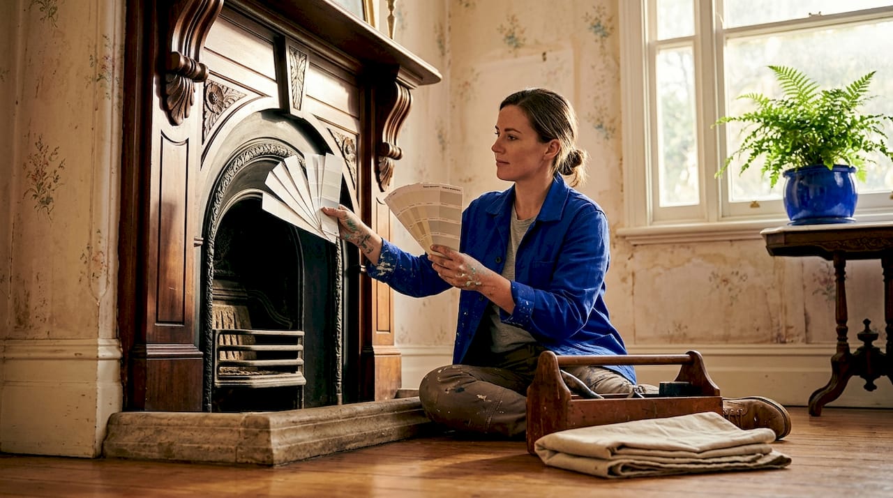
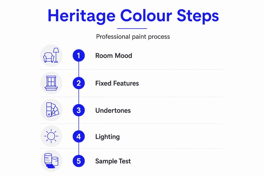
Before you open a single colour catalogue, you need to understand the room you are working with. Professionals follow a strict sequence: mood first, then fixed elements, undertones, lighting, and finally sample testing. Skipping any step is where most colour mistakes originate.
Defining the mood and function
Ask yourself how you want the room to feel. A bedroom should typically feel calm and restful. A kitchen or dining room can carry more energy. A sitting room in a Victorian terrace may benefit from something grounded and warm. Once you have named that feeling, your colour shortlist practically narrows itself.
Reading your room’s orientation and natural light
Room orientation matters more than most homeowners realise. North-facing rooms receive cool, dim natural light throughout the day and benefit from warm-toned paint to compensate. South-facing rooms receive warm, bright light and can carry cool tones without feeling cold. East-facing rooms are bright in the morning and dim by afternoon, so mid-tone warm neutrals tend to work well across both conditions.
Light Reflectance Value, or LRV, is a measurement that tells you how much light a paint colour reflects on a scale of zero to one hundred. An LRV above 60 suits low-light rooms to keep them feeling open, while ceilings generally perform best with an LRV above 85.
Artificial light and heritage features
Artificial lighting significantly alters paint perception. Incandescent globes push warm tones further yellow. Fluorescent lighting cools blues and greens. Halogen lighting comes closest to natural daylight and gives you the most accurate read on a colour.
Before finalising your shortlist, consider your fixed elements. These are the things that will not be painted or changed.
- Timber floorboards (red or yellow undertones are common in Victorian homes)
- Sandstone or brick fireplaces
- Heritage timber trims, skirtings, and architraves
- Cabinetry in kitchens or built-in joinery
- Existing floor or wall tiles in bathrooms and hallways
Each of these elements carries an undertone. Your paint colour needs to complement those undertones, not fight them.
Pro Tip: Hold your paint strip samples next to your timber floor or stone hearth in natural light. If the strip looks greener or pinker than expected, it is reacting to the undertone of the fixed element beside it.
Decoding undertones and the 60/30/10 rule
Undertones are the subtle secondary hues sitting beneath a paint colour’s surface appearance. A wall painted in what appears to be a crisp beige may carry a green, pink, or yellow undertone that only becomes visible once it is on all four walls and reacting to your room’s light and existing finishes. Failing to align undertones with fixed elements is the single biggest cause of paint regret.
Identifying undertones accurately
The most reliable method is holding your paint strip next to a sheet of pure white paper. The subtle shift you see in the strip reveals its undertone. A second method is placing two seemingly similar neutrals side by side. What looks like an identical warm white on one strip may appear noticeably more pink or more yellow when placed next to another.
Undertones fall into three broad families.
- Warm undertones: yellow, red, peach, or orange. These suit homes with red or golden-toned timber, warm brick, and sandstone.
- Cool undertones: blue, green, or violet. These work well with grey stone, white marble, and chrome or brushed nickel fixtures.
- Neutral undertones: balanced between warm and cool. These offer the most flexibility but can read as flat if not supported by layered accents.
For heritage homes with Victorian and Edwardian architectural details, warm and neutral undertones typically perform best. They complement the tonal qualities of period timbers and heritage renders without creating jarring contrast.
Applying the 60/30/10 rule
The 60/30/10 rule is the most reliable framework for balanced colour distribution in any room. It works as follows.
| Proportion | Application | Example in a heritage sitting room |
|---|---|---|
| 60% dominant | Walls and large surfaces | Warm sage or deep clay on the walls |
| 30% secondary | Soft furnishings, curtains, upholstery | Cream or ochre linen sofa and drapes |
| 10% accent | Decorative objects, cushions, artwork | Terracotta or deep teal accessories |
The rule prevents any single colour from overwhelming the space and creates a layered, considered result. In practice, the dominant wall colour should anchor the room without carrying too much visual weight on its own.
Pro Tip: When selecting your 30% secondary colour, choose something from the same undertone family as your wall colour but at a different value (lighter or darker). This creates harmony without monotony.
Sampling paint colours the right way
Most homeowners select their final paint colour after viewing a small strip under store lighting. This is one of the most reliable ways to end up with a result you dislike. Fluorescent store lighting distorts colour perception significantly, and a swatch that looked warm and inviting in the shop may appear green or flat on your heritage walls.
Follow these steps to sample properly.
- Narrow your choices by undertone family and LRV first. Use major paint brands’ online tools to filter by hue family before you even visit a store. This reduces a shortlist of hundreds to a manageable ten or twelve.
- Purchase sample pots, not swatches. A painted patch gives you genuine coverage and colour depth that a printed swatch cannot replicate.
- Paint large patches on multiple walls. Patches of at least 30 x 30 centimetres on two or three walls give you accurate readings across different exposures. Heritage rooms with ornate cornices and deep skirtings need this particularly, as the colour reads very differently near those details.
- Observe at different times of day. View the patch in morning light, afternoon light, and under your artificial lighting in the evening. Colours can shift dramatically between these conditions.
- Leave the samples up for at least 48 hours. The paint needs to cure fully and you need enough time to observe it without the novelty factor influencing your judgement.
- Use peel-and-stick sample boards if repainting feels premature. These allow you to move the sample around the room and position it next to your fixed elements without committing to a patch on the wall.
Common mistakes to avoid include holding a sample up to the wall without painting it on (the white of the card distorts the reading), choosing solely based on morning light, and testing only on the lightest wall in the room.
Pro Tip: Take a photo of your sample patch on your phone at different times of day with no flash. The camera does not compensate for colour shifts the way your eye does, so the photos reveal undertone changes you might otherwise miss.
Coordinating colours across connected rooms
In heritage homes, the challenge of choosing colours for home extends beyond individual rooms. Many Victorian and Edwardian properties have visible sightlines through hallways into sitting rooms, or from dining areas into kitchens. A colour that works perfectly in isolation can feel jarring when viewed from an adjoining space.
The most reliable strategy for open or connected spaces is to anchor all rooms in a single undertone family, varying the saturation and value rather than switching between warm and cool. A home with golden-toned timber throughout will feel most cohesive when all visible rooms share a warm undertone, even if the hues themselves are quite different.
Strategies that work particularly well for heritage interiors include:
- Keeping hallways and circulation spaces at a lower saturation than the rooms they connect, so the rooms feel like destinations rather than extensions of the same surface.
- Using the same trim colour throughout the entire home. Heritage timber trim in a consistent white, such as Dulux Lexicon Quarter, creates a thread of continuity that holds disparate room colours together.
- Treating ceilings in heritage rooms as part of the colour scheme. A warm off-white ceiling in a room with deep jewel-toned walls reads as considered and refined rather than accidental.
- Reserving bolder or more saturated colours for isolated rooms, such as a study, powder room, or formal dining room that does not share a sightline with the main living area.
| Room type | Colour approach | Undertone consideration |
|---|---|---|
| Hallway | Lower saturation, mid-value neutral | Match to adjoining rooms |
| Sitting room | Warm mid-tone with layered accent | Consistent with timber floors |
| Formal dining | Deeper saturation, jewel tone acceptable | Isolated sightline allows bolder choice |
| Bedroom | Calm, muted, restful tone | Align with existing furnishings |
| Heritage façade | Period-appropriate palette | Match render, brick, and trim undertones |
Heritage homes with dark or low-light rooms deserve particular attention. The instinct to paint them white is understandable but frequently counterproductive. Bright whites in dark heritage rooms often produce a dull, clinical result that strips the room of its character. Warm pink-tinged neutrals, deep clay tones, or saturated deep colours with warm undertones consistently outperform stark white in these spaces, adding depth and preserving the authenticity that makes heritage homes worth restoring.
What I have learned after years of heritage painting
I have spent years working on Victorian and Edwardian homes across Melbourne’s inner suburbs, and the one observation that keeps proving itself right is this: most homeowners spend too long choosing and not long enough testing.
The selection process feels decisive. Picking a colour from a swatch feels like progress. But the real work happens on the wall, over 48 hours, in the actual light of the actual room. I have seen beautiful heritage parlours saved by a sample that revealed a green undertone no one had noticed before. I have also seen careful colour selections undermined by a trim colour that came from a different undertone family and fought everything around it.
Undertone matching is the most underestimated skill in this entire process. It is not difficult once you know what you are looking for, but it requires patience and a willingness to trust what you see on the wall rather than what you loved in the store. Heritage homes do not reward shortcuts here. Their proportions, their original materials, and their period details are unforgiving of colours that are nearly right. The margin is smaller than in a modern build.
My strongest advice: treat paint selection for heritage homes as a staged process, not a single decision. Mood, then fixed elements, then undertones, then sampling. Do not move to the next stage until you are confident in the one before it. That sequence is not bureaucratic. It is the method that avoids expensive repainting.
— Jarrad
Ready for a professional result?
Choosing the right colours is only part of the equation. The quality of the application, the preparation of heritage surfaces, and the selection of appropriate paint materials all determine whether the final result does justice to your home.

Sol Shine specialises in heritage interior painting and full-scale restoration for Victorian and Edwardian homes across Melbourne, including Kew, Hawthorn, Camberwell, Brighton, and Malvern. The team works with premium paints suited to period properties, and every project is managed under one roof from colour consultation through to completion. Explore Sol Shine’s heritage painting projects for real examples of colour and finish work on Melbourne’s finest period homes, or get in touch to discuss your property directly.
FAQ
What is the best order for choosing paint colours?
Professionals select paint in this sequence: mood, fixed elements, undertones, lighting conditions, and then sample testing. Skipping steps, particularly undertone assessment, is the most common cause of unsatisfactory results.
How do undertones affect paint colour choices?
Undertones are the subtle secondary hues beneath a paint colour’s surface that interact with your room’s light and fixed finishes. Misaligned undertones cause colours to feel off once applied, even if the swatch looked perfect in isolation.
Should I use white paint in dark heritage rooms?
Generally, no. Bright whites in low-light rooms often feel clinical and flatten the character of heritage spaces. Warm-toned neutrals or deeper saturated colours with warm undertones typically produce a richer, more authentic result.
How long should I test paint samples before deciding?
Test painted samples for at least 48 hours, viewing them at different times of day and under different lighting conditions. Patches of at least 30 x 30 centimetres on multiple walls give the most accurate reading across the room.
What colour palette suits a Victorian or Edwardian home?
Period-appropriate palettes typically draw on warm neutrals, deep jewel tones, and heritage greens or ochres with warm undertones that complement original timber, render, and brick. Consistent trim colours in warm off-whites, applied throughout, hold the scheme together across connected spaces.


