
TL;DR:
- Choosing period paint colours for Melbourne heritage homes requires understanding heritage overlays, architectural styles, and practical considerations like sunlight and surface conditions. Victorian palettes emphasize layered, rich hues with multiple colours, while Edwardian schemes favor light, natural tones with subtle contrasts; both reflect their respective eras’ architectural character. Engaging specialist heritage painters ensures authentic application, proper preparation, and compliance, preserving your home’s unique charm and longevity.
Choosing period paint colour ideas for your Melbourne Victorian or Edwardian home is one of the most consequential decisions you’ll make during a renovation. Get it right and your home resonates with the character and craftsmanship it was built to display. Get it wrong and even the most carefully restored lacework or timber trim looks out of place. The challenge isn’t simply picking a shade you like. It’s navigating heritage overlays, council permit requirements, architectural substyle considerations, and colour palettes that span 150 years of evolving taste. This guide gives you a clear, practical framework to make confident, well-informed choices.
Table of Contents
- Criteria for choosing period paint colours on heritage homes
- Victorian paint colour ideas: classic palettes and modern approaches
- Edwardian paint colour ideas: light, airy palettes with subtle contrasts
- Comparing Victorian and Edwardian paint palettes for your home
- Choosing the right paint colours for your Melbourne period home: practical tips and expert advice
- Rethinking period paint colours: balancing authenticity with livability
- Specialist painting services for Melbourne heritage homes
- Frequently asked questions
Key Takeaways
| Point | Details |
|---|---|
| Heritage guidelines matter | Melbourne heritage overlays often require permits and favour historically accurate paint colours. |
| Victorian palettes are rich | Victorian homes use multi-colour layered schemes to highlight ornate architectural details. |
| Edwardian colours are lighter | Edwardian interiors prefer light, sunny neutrals with subtle bold accents for airiness. |
| Balance authenticity and modernity | Modern neutrals can complement heritage features when paired with restoration efforts. |
| Use expert painters | Professional heritage painting services help ensure compliance, accuracy, and durability. |
Criteria for choosing period paint colours on heritage homes
Before you open a colour card, you need to understand what constraints and opportunities your specific property presents. Period homes in Melbourne sit within a varied regulatory landscape, and skipping this step leads to expensive corrections down the track.
Heritage overlays and permits are the first thing to verify. Melbourne homeowners with heritage overlays require permits to repaint exteriors where paint controls apply, adding weeks to approval timelines. Importantly, painting unpainted brick always requires permits, so checking your heritage overlay schedule before any work begins is essential. Your local council’s planning department can confirm whether your property falls under these controls.
Architectural style and substyle directly shape which colour palettes are appropriate. A late Victorian Italianate villa in Kew supports a very different palette than a Federation-era bungalow in Camberwell. Ornate Victorian homes with decorative brackets, bargeboards, and cast iron verandah columns have the architectural vocabulary to carry multi-colour schemes. Simpler Edwardian homes read better with quieter, more unified palettes.
Practical considerations matter just as much as historical accuracy. Here’s what to assess before committing:
- Sunlight exposure: North-facing façades fade lighter colours quickly. Pigment-rich heritage tones often hold better in Melbourne’s UV intensity.
- Paint finish type: Use flat or low-sheen for rendered walls to reduce surface imperfection visibility. Semi-gloss on timber trim and window sashes creates the period-accurate contrast and provides moisture resistance.
- Surface condition: Heavily weathered render or timber requires thorough preparation before any colour decision makes practical sense.
- Maintenance cycle: Darker colours absorb more heat and can cause timber to expand and paint to peel faster on exposed elevations.
For more detailed guidance on paint selection for heritage homes, understanding the interplay of surface, finish, and colour is critical to a lasting result.
Now that you understand the essential criteria shaping paint colour choices, let’s explore specific period paint ideas for Victorian homes.
Victorian paint colour ideas: classic palettes and modern approaches
Victorian homes, particularly those built in Melbourne between the 1850s and 1890s, were designed to impress. Their architecture is layered, confident, and deliberate. The paint scheme should reflect that.
Traditional polychrome schemes are the hallmark of authentic Victorian colour. Victorian paint schemes often use 3 to 5 colours per façade: a medium-dark base, cream trim, and accent colours like brick red, with darker lower portions and lighter upper areas. This layering wasn’t merely decorative. It followed architectural logic, drawing the eye upward and highlighting ornamental details at each tier.
Typical colours you’ll find in historically verified Victorian palettes include:
- Base wall colours: Deep olive, slate blue-grey, warm terracotta, or muted forest green
- Trim and cornice detail: Cream, buff, or warm off-white
- Accent colours for brackets, sashes, and iron lacework: Brick red, deep burgundy, or charcoal
- Verandah ceilings: Traditionally painted sky blue, a practice with both aesthetic and practical origins
For formal interior rooms, Victorian colour logic favoured richness and depth. Drawing rooms and parlours used burgundy, deep teal, or tobacco brown on walls, paired with ivory or cream cornicing and picture rails. These dark, enclosing tones created the intimate atmosphere that Victorian domestic culture valued.
Modern authentic approaches work well for homes with simpler Victorian detailing. A two to three colour exterior scheme using warm stone, deep heritage green, and cream trim still reads as period-correct without requiring intricate accent painting on every bracket. This works particularly well on terrace houses in Fitzroy or Richmond where the architectural detail is present but restrained.
Pro Tip: Before settling on a Victorian palette, examine what colours neighbouring period homes use. In heritage streetscapes, individual homes benefit from a coherent street character, and councils often favour schemes that sit comfortably within that established visual context.
For a full breakdown of historically grounded options, our Victorian paint guide covers specific colour combinations matched to Melbourne substyles.
With Victorian palettes outlined, let’s examine Edwardian-era colour ideas reflecting their lighter, airier style.
Edwardian paint colour ideas: light, airy palettes with subtle contrasts
Edwardian homes, built roughly between 1901 and 1915, represent a conscious shift away from the heaviness of Victorian taste. Wider hallways, larger windows, and a preference for natural light defined the era, and the colour palettes followed suit.
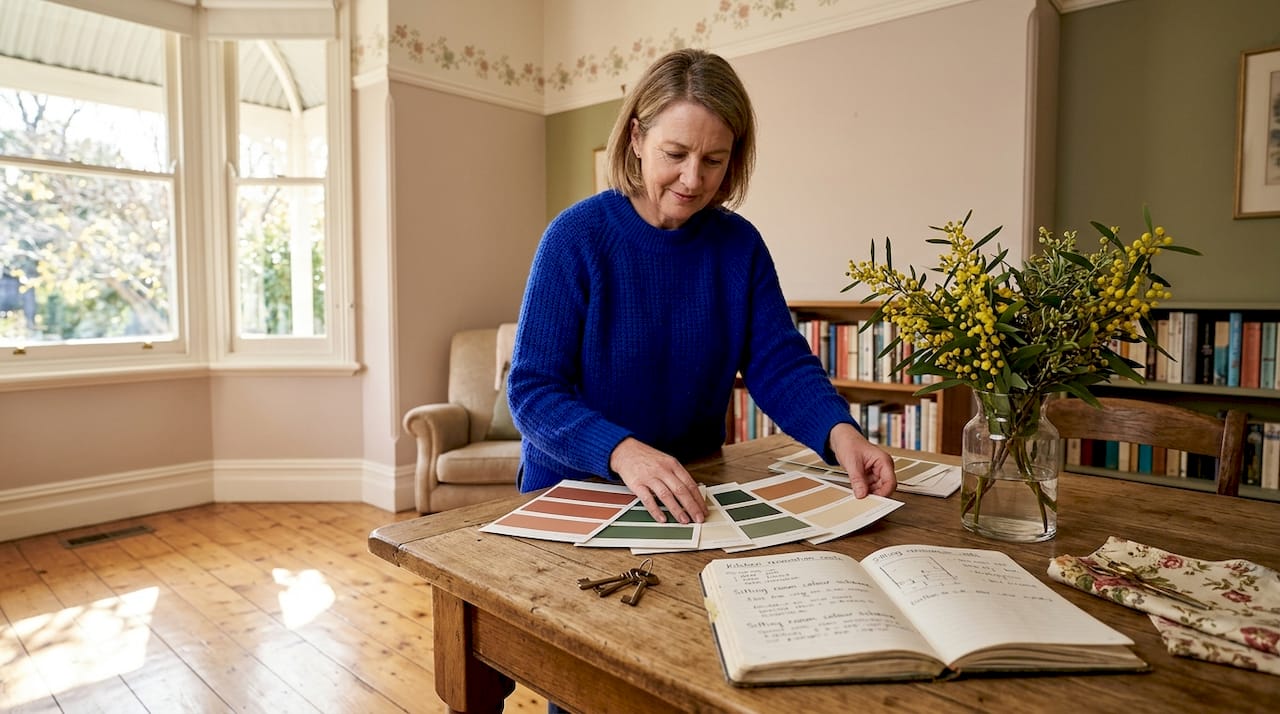
Typical Edwardian colours draw heavily from the Arts and Crafts Movement, which favoured earthy naturals over the saturated polychromy of the Victorian era. Edwardian palettes favour light colours like White Clay and Little Rascal for interiors, paired with bold blues like Dorothy as accents, using 3 to 4 colours per scheme. These names are instructive in tone. You’re working with the warmth of natural linen, the softness of aged plaster, and the clarity of a summer sky rather than rich jewel tones.
Common Edwardian colour pairings by room type:
- Entrance halls: Warm cream or ochre base with deep sage or bottle green dado panels, reflecting the period’s love of the outdoors
- Living rooms: Soft honey or warm white walls with hand-painted or stencilled friezes in cobalt blue or terracotta
- Bedrooms: Pale sage, lavender-grey, or dusty rose with white trim, creating calm and restful spaces
- Exterior façades: Cream or pale buff render, with darker window sashes in charcoal or deep green, and white or cream timber trim
Stencilled friezes deserve special mention. This was a defining Edwardian interior technique. Running along walls at picture rail height, friezes used repetitive floral or geometric motifs in bold contrasting colours. Restoring or recreating this detail transforms a painted Edwardian interior from period-correct to genuinely period-rich.
Pro Tip: Edwardian homes with original leadlight windows already carry strong colour statements in amber, green, and cobalt. When selecting wall colours, hold paint samples against the light cast by these windows to ensure the palette harmonises rather than clashes with your existing glass.
Our guide on Edwardian paint colour ideas explores specific palette options matched to Melbourne’s most common Edwardian substyles.
Now that we’ve explored Edwardian colour ideas, we’ll summarise key differences and help you compare these period palettes side by side.
Comparing Victorian and Edwardian paint palettes for your home
Understanding which era your home belongs to helps enormously, but many Melbourne properties show features of both periods or have been altered over time. This comparison gives you a practical reference point.
| Feature | Victorian | Edwardian |
|---|---|---|
| Typical wall colours | Deep olive, terracotta, slate blue, forest green | Cream, ochre, warm white, pale sage |
| Trim colours | Buff, cream, ivory | White, soft cream |
| Accent colours | Brick red, burgundy, charcoal | Cobalt blue, deep green, terracotta |
| Number of exterior colours | 3 to 5 | 3 to 4 |
| Interior style | Rich, enclosing, layered | Light, airy, naturalistic |
| Key influence | Gothic Revival, Italianate, Renaissance styles | Arts and Crafts Movement |
| Best suited rooms | Formal parlours, studies, dining rooms | Living rooms, bedrooms, open hallways |
A few clarifying points on how to read this comparison:
- Ornate detail on your home increases flexibility. Councils prefer historical palettes but increasingly accept neutrals if paired with restoration works like cast iron lacework highlighting.
- If your home has been rendered over original brick, this affects which palette era is appropriate and what permit pathway you’ll follow.
- Interior and exterior palettes don’t need to match era-for-era. A Victorian exterior with a more Edwardian-influenced interior is common and entirely valid.
Avoiding common errors during this process is worth reading up on. Our article on painting mistakes to avoid covers the decisions that cost Melbourne homeowners the most when they get the colour or preparation wrong.
Understanding these contrasts, let’s consider how to decide the best scheme based on your home’s features and practical needs.
Choosing the right paint colours for your Melbourne period home: practical tips and expert advice
With criteria and palettes covered, here is a step-by-step process for making a final colour decision with confidence.
-
Verify your council’s heritage overlay and any paint controls. Contact your local council planning department and request the heritage overlay schedule for your property. This confirms what requires a permit and whether there are preferred or prohibited colours for your streetscape.
-
Identify your home’s substyle and key architectural details. Is it a two-storey Italianate with decorative pilasters, or a modest single-fronted terrace? The complexity of your detailing determines how many colours your scheme can realistically carry.
-
Commission a paint scrape analysis where budget allows. This involves carefully removing layers of existing paint to reveal original colours applied at the time of construction. It provides empirical evidence for your palette and can strengthen a discretionary permit application.
-
Shortlist 3 to 5 colours and test them at scale. A painted A3 card in the sun is not sufficient. Apply each candidate colour in at least a 30 by 30 centimetre patch on the actual surface and observe it at different times of day.
-
Balance heritage compliance with personal liveability. A colour scheme you can’t live with will be repainted within five years, which costs money and disrupts heritage streetscapes unnecessarily.
“Checking your heritage overlay schedule before lifting a brush is the single most important step Melbourne homeowners skip, yet it determines whether your project proceeds smoothly or stalls at the permit stage.”
Pro Tip: If your restoration project involves render repair, timber work, or brickwork alongside repainting, engage a heritage consultant early. Combining works under a single permit application is often faster and more cost-effective than sequential approvals.
Good surface preparation underpins every colour decision. Our painting maintenance tips explain how proper preparation affects both the final appearance and the longevity of your chosen palette.
Rethinking period paint colours: balancing authenticity with livability
There’s a tendency among Melbourne homeowners restoring Victorian and Edwardian homes to treat historical accuracy as the absolute goal. It’s an admirable instinct, but it isn’t always the right one.
Paint is a finishing layer, not a structural decision. As one contemporary heritage perspective frames it, paint should strengthen heritage values rather than strictly mimic the past, and modern neutrals can serve as recessive backdrops enhancing ornamentation rather than competing with it. This matters practically. A heavily ornamented Victorian façade in Hawthorn with restored cast iron lacework, timber fretwork, and detailed bargeboards doesn’t need five strong colours to look impressive. A refined two-colour scheme in warm stone and deep charcoal can let the architectural detail speak far more clearly than a historicised palette that fragments the eye’s attention.
The real investment in period homes is in the quality of the surface preparation and restoration work beneath the paint. When the render is sound, the timber is properly sealed, and the ironwork is treated and primed correctly, your colour choices carry genuine weight. Poor preparation beneath a historically perfect colour is still a failed result.
There’s also the matter of livability. A home painted in an authentic 1880s palette that feels oppressive to modern eyes won’t be loved and maintained the way a well-cared-for heritage property deserves to be. Choosing exterior paint ideas that balance period character with how you actually live in your home is not a heritage compromise. It is good stewardship.
The homes that fare best over the long term are those where the owners feel genuine connection to the colours they’ve chosen, guided by an informed understanding of what the property is and what it represents.
Specialist painting services for Melbourne heritage homes
Selecting the right palette is only half the work. Applying it to a heritage property with the precision, preparation, and period knowledge it demands is where the difference between a good result and a remarkable one is made.

Sol Shine specialises in painting and full heritage restoration for Victorian and Edwardian homes across Melbourne’s inner east, bayside, and surrounding suburbs including Kew, Hawthorn, Camberwell, Brighton, Malvern, and Fitzroy. Our heritage painting services cover everything from period colour consultation and permit support through to meticulous surface preparation, render repair, and timber restoration, all handled under one roof. Browse our completed exterior painting projects and interior painting projects to see how we’ve brought authentic period palettes to life across Melbourne’s most characterful homes. If you’re planning a restoration and repainting project, we’d welcome the conversation.
Frequently asked questions
Do I need a permit to repaint my Victorian or Edwardian home in Melbourne?
Yes. If your home sits under a heritage overlay or paint controls apply, you generally need a planning permit before repainting exterior surfaces. Heritage overlays require permits where paint controls apply, particularly if you’re painting previously unpainted brick.
How many colours were traditionally used on Victorian house exteriors?
Victorian homes typically feature three to five colours per façade. Victorian schemes use a layered approach with a medium-dark base, cream trim, and accent colours such as brick red, with darker shades below and lighter tones above.
What are typical Edwardian interior paint colours?
Edwardian interiors favour light, naturalistic tones. Edwardian palettes use light colours like White Clay and Little Rascal alongside bold blue accents such as Dorothy for stencilled friezes, producing fresh and airy room schemes.
Can I use modern neutral colours on a heritage home?
Yes, provided the palette respects and highlights the home’s heritage values. Modern neutrals are increasingly accepted by councils when paired with restoration works such as cast iron lacework highlights, which demonstrate genuine commitment to heritage preservation.
What is the benefit of hiring specialist heritage painting services?
Specialist heritage painters ensure council compliance, authentic colour matching, and careful surface preparation. They protect your home’s period features while delivering a finish that extends the life of the paintwork and enhances the property’s long-term value.


