
TL;DR:
- Heritage paint colours are predominantly muted, earthy tones that reflect the original architectural palettes. Selecting authentic colours and breathable paint types is essential to preserve Melbourne’s historic homes and meet council regulations. Proper consultation and careful colour matching ensure the preservation of each property’s character and compliance with heritage standards.
Common heritage paint colours are subdued, earthy tones drawn directly from the original palettes of Federation, Victorian, and Interwar homes. For Melbourne homeowners, selecting the right colours means more than aesthetics. It means respecting architectural history, satisfying council requirements, and preserving the character that makes these properties worth protecting. The most recognised heritage palettes for Australian homes prioritise muted, natural tones over high-contrast modern schemes, with Federation red, heritage green, classic cream, and sandstone yellow sitting at the core of any authentic selection.
1. What are the most common heritage paint colours?
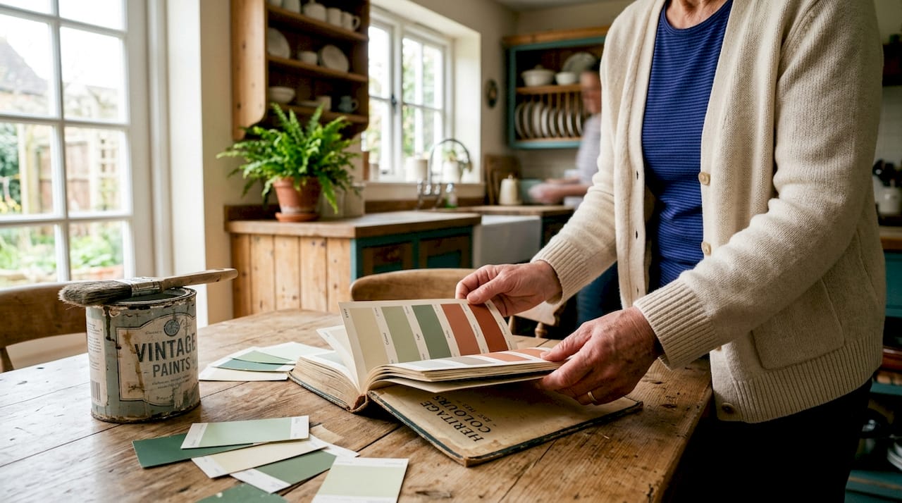
Standard heritage palettes for Australian homes prioritise earthy, muted tones over high-contrast modern schemes. The top eight colours used in 2026 include Federation red, heritage green, classic cream, sandstone yellow, Victorian blue, slate grey, charcoal and deep iron, and warm white. Each of these sits within a specific architectural tradition and carries visual weight that modern palettes simply do not replicate.
Federation red appears most often on brick homes built between 1890 and 1915, used on rendered details, window surrounds, and verandah columns. Heritage green suits timber joinery and cast iron lacework on Victorian terraces. Classic cream and sandstone yellow work across rendered masonry and weatherboard exteriors, softening the façade while maintaining period warmth.
Pro Tip: Sample your shortlisted colours on the actual substrate in both morning and afternoon light before committing. Heritage tones shift significantly across Melbourne’s variable light conditions.
2. Which colours suit Victorian homes specifically?
Victorian homes embrace maximalism, and their colour palettes reflect that with rich contrasts and layered tones. The typical Victorian exterior combines a deep body colour with contrasting trim, often pairing a warm ochre or terracotta with heritage green or slate grey on the joinery and lacework.
Interior palettes from this era favoured deep, saturated tones in formal rooms. Drawing rooms and hallways often used burgundy, forest green, and navy, while service areas stayed neutral. Replicating this approach today means selecting a dominant body colour, a contrasting trim colour, and a third accent for decorative elements like brackets and finials.
The key principle is contrast without clash. Victorian colour schemes were deliberate and structured, never random. Consulting a period-accurate colour guide before selecting your palette prevents the most common visual errors.
3. Which colours suit Federation and Edwardian homes?
Federation homes, built roughly between 1890 and 1915, favour earth-born tones that mirror natural surroundings. Sandstone yellow, warm cream, and terracotta red dominate the exterior, with heritage green and deep brown used on timber joinery and verandah posts.
Edwardian homes, slightly later and more restrained, suit softer palettes. Pale sage, warm white, and stone grey work well on rendered surfaces, with darker trims on windows and doors providing definition without drama. The Edwardian preference for simplicity means fewer accent colours and cleaner transitions between body and trim.
Both eras share a commitment to natural pigments and muted saturation. Colours that read as “dusty” or “aged” in a paint chip are usually the right direction for these homes.
4. How to select colours that comply with Melbourne council regulations
Melbourne’s heritage overlay system requires homeowners to obtain council approval before repainting the exterior of a protected property. The approval process varies by council, but the core requirement is consistent: colours must reflect the original or period-appropriate palette for the home’s era and style.
The steps most councils expect are:
- Identify whether your property sits within a heritage overlay zone by checking your council’s planning scheme.
- Contact your council’s heritage advisor to confirm which colour families are acceptable for your property type and era.
- Prepare a colour schedule that names specific paint products and finishes, not just general descriptions.
- Submit the colour schedule with your planning permit application, including photographs of the existing façade.
- Wait for written approval before commencing any exterior painting work.
Professional restoration projects at the $20,000-plus level typically include expert colour selection as part of the scope, which reduces the risk of council rejection. Councils favour original period-accurate schemes, and a professional colour consultant can prepare documentation that meets heritage advisor expectations on the first submission.
Pro Tip: Ask your council heritage advisor for examples of recently approved colour schedules in your street. This gives you a concrete reference point and signals to the council that you have done your research.
5. What traditional paint types enhance heritage authenticity?
The paint type matters as much as the colour. Heritage masonry and timber require breathable finishes that allow moisture to move through the substrate. Modern acrylic paints can trap moisture and damage heritage masonry, causing spalling, cracking, and long-term structural deterioration.
The three paint types best suited to heritage substrates are:
| Paint type | Best substrate | Key benefit |
|---|---|---|
| Limewash | Masonry, brick, render | Breathable, ages naturally, period-accurate |
| Mineral silicate paint | Masonry, stone | Extreme durability, bonds chemically to substrate |
| Breathable emulsion | Timber, plaster | Flexible, moisture-permeable, wide colour range |
Limewash is tinted with traditional earth pigments including yellow ochre, raw umber, and red iron oxide, up to 5% by weight for heritage masonry and timber. This keeps the finish authentic and compatible with original lime-based substrates. Mineral silicate paints offer durability of 30–50 years on suitable surfaces, making them a sound long-term investment for rendered façades.
Paints with low SD values between 0.05 and 0.2 metres allow moisture vapour transmission, which is critical for avoiding spalling and structural damage in heritage homes. Selecting a paint with the correct breathability rating is a technical decision, not just an aesthetic one.
Pro Tip: Always test paint compatibility on a small, inconspicuous section of the substrate before full application. Some heritage renders react poorly to modern binders, even in products marketed as heritage-compatible.
6. How to use heritage colours creatively for interiors and exteriors
Heritage colours are moving away from bold modern tones towards deeper, muted shades that create calming, sophisticated environments. Navy, inky blue, sage green, warm neutrals, and earthy reds are all gaining renewed interest among homeowners who want historical accuracy without a museum-like result.
Practical approaches for combining heritage colours effectively include:
- Use the body colour on the largest surface area and reserve deeper tones for joinery, window frames, and doors.
- Pair warm neutrals like classic cream or sandstone yellow with a single deep accent such as heritage green or Federation red on the front door.
- On interiors, carry the exterior palette inward by using a lighter version of the body colour in hallways and a deeper version in formal rooms.
- Avoid mixing warm and cool tones within the same elevation. Warm ochres and cool greys read as discordant on period homes.
- Use period-accurate colour combinations as your starting point, then adjust saturation to suit your home’s specific light and orientation.
Different architectural eras demand tailored approaches to colour palettes to respect original designs and materials. A Victorian terrace in Fitzroy calls for a different palette than a Federation bungalow in Hawthorn, even if both properties share the same street.
7. What are the most common mistakes to avoid?
Colour mistakes on heritage homes are costly to fix and can trigger council enforcement action. The most frequent errors include:
- Applying non-period palettes. Using a contemporary grey or white on a Victorian terrace reads as visually incorrect and may breach heritage overlay conditions.
- Ignoring substrate compatibility. Painting over lime render with a non-breathable acrylic traps moisture and causes the render to fail within a few years.
- Choosing overly bright or saturated tones. Modern paint ranges include colours that are far too vivid for period homes. Heritage authenticity requires muted, dusty saturation.
- Skipping council approval. Repainting a heritage exterior without a permit can result in an enforcement notice requiring you to repaint at your own cost.
- Overlooking maintenance cycles. Limewash and mineral silicate paints require periodic reapplication. Factoring this into your long-term budget prevents deferred maintenance from compounding.
Avoid the three most damaging neutral choices for heritage homes: greenish-cast trade whites, yellow chalky magnolias, and blue-white glares. Warm oatmeal and stone-toned neutrals age far better and maintain period character across Melbourne’s variable seasons.
Misapplication of generic heritage colours across eras is one of the most common errors in restoration work. A colour that is historically accurate for one era can look completely wrong on a home from a different period.
Key takeaways
Selecting the right heritage paint colours requires matching the palette to the architectural era, choosing breathable paint types, and securing council approval before any exterior work begins.
| Point | Details |
|---|---|
| Prioritise earthy, muted tones | Federation red, heritage green, classic cream, and sandstone yellow are the most period-accurate choices. |
| Match colours to the architectural era | Victorian, Federation, and Edwardian homes each require distinct palettes to maintain authenticity. |
| Choose breathable paint types | Limewash and mineral silicate paints protect heritage substrates; modern acrylics can cause lasting damage. |
| Secure council approval first | Melbourne heritage overlay zones require a colour schedule and written approval before exterior repainting. |
| Avoid common colour errors | Overly bright tones, chalky whites, and non-period palettes all reduce authenticity and risk enforcement action. |
What I have learned selecting heritage colours in Melbourne
Working on heritage homes across Kew, Hawthorn, Camberwell, and Brighton has taught me that colour selection is where most projects either succeed or quietly fail. Homeowners often arrive with a heritage paint range brochure and a shortlist of colours they love. The problem is that loving a colour and that colour being right for your home are two different things.
The most useful thing I have done on complex projects is walk the street before touching a paint chip. The neighbourhood context tells you more than any colour chart. A home that sits among warm sandstone and cream façades needs to read as part of that streetscape, not against it. Councils notice when a property breaks the visual rhythm of a heritage precinct, and so do neighbours.
I have also found that professional colour consulting pays for itself on projects above $20,000. A consultant who knows Melbourne’s heritage overlays can prepare a colour schedule that sails through council approval, saving weeks of back-and-forth. The cost is a fraction of a rejected permit and a repaint.
My honest view is that homeowners underestimate how much the paint type matters relative to the colour. Getting the colour right and then applying it in a non-breathable modern acrylic is a slow-motion disaster on lime render. The substrate preparation and paint specification deserve as much attention as the colour selection itself.
— Jarrad
Heritage painting expertise for Melbourne period homes
Sol Shine specialises in heritage painting and restoration for Victorian and Edwardian homes across Melbourne’s inner east and bayside suburbs. Every project includes period-accurate colour selection, substrate assessment, and council-compliant colour schedules prepared by experienced tradespeople who understand heritage overlay requirements.

Sol Shine’s heritage painting portfolio covers exterior and interior repaints, render repair, timber restoration, and architectural woodwork, all handled under one roof. For homeowners planning a large-scale restoration, Sol Shine manages the full scope from colour selection through to final coat, with no subcontracting and no shortcuts. Get in touch to discuss your project and receive a detailed assessment of your home’s colour and substrate requirements.
FAQ
What are the most common heritage paint colours in Australia?
The most common heritage paint colours for Australian homes are Federation red, heritage green, classic cream, sandstone yellow, Victorian blue, slate grey, charcoal, and warm white. These earthy, muted tones reflect the original palettes of Federation, Victorian, and Interwar properties.
Do I need council approval to repaint my heritage home in Melbourne?
Yes. Properties within a heritage overlay zone in Melbourne require council approval before exterior repainting. You need to submit a colour schedule with specific paint products and finish details, along with photographs of the existing façade.
What paint type is best for heritage masonry?
Limewash and mineral silicate paints are the best options for heritage masonry. They are breathable, allow moisture vapour to pass through the substrate, and avoid the spalling and cracking caused by non-breathable modern acrylics.
Can I use modern paint colours on a heritage home?
Modern paint colours are generally not appropriate for heritage homes. Colours that are too bright, too cool, or too saturated look visually incorrect on period properties and may breach heritage overlay conditions set by your local council.
How do I match colours to my home’s architectural era?
Identify your home’s era first: Victorian, Federation, Edwardian, or Interwar. Each era has a distinct palette. Consult your council’s heritage advisor or a professional colour consultant to confirm which colour families are appropriate for your specific property type and street context.


